
Project Overview
Background Context
Jet2 is the third largest airline in the UK, primarily flying across European destinations. We have been tasked to conduct a heuristic evaluation of Jet2’s existing web-app infrastructure to enhance the user experience.
The Problem
We discovered that Jet2’s web-app often suffers from inconsistencies and encounters problems during the navigation process. This is a pain point for users when trying to book flights for their holidays, leading to an increase in booking abandonment.
The Solutions
As a group of UX designers, we evaluated the usability of Jet2’s existing web-app and made informed design changes that will solve reoccurring customer pain points when finding and booking a flight. We did this by highlighting key pain points through the use of Jakob Nielsen’s 10 Usability Heuristics, followed by the prioritisation of key issues within the task flow to tackle.
Our Approach
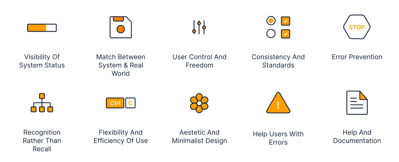
We used Jakob Nielsen’s 10 Usability Heuristics for User Interface Design to identify areas of intervention to help alleviate customer pain points during the flight booking process. As this is the primary objective for most of Jet2’s customers, changes to this flow would have the greatest impact towards the business goals.
We tackled 6 key heuristics that would improve the customers’ experience throughout this process. Main issues encountered were the consistency and visual appeal of the interface, which affects the overall usability of the web-app.
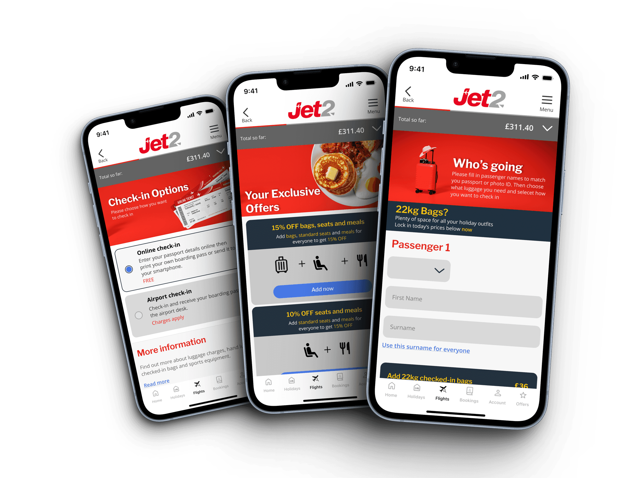
Task Flow

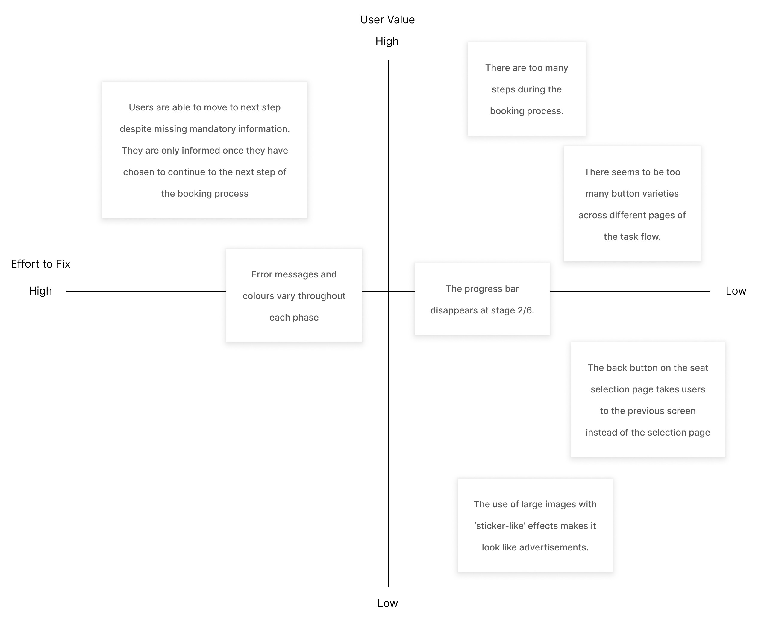
Design Prioritisation Matrix
Our Solutions
After pinpointing the key issues we wanted to tackle and compiling them on a design prioritisation matrix, we revised specific sections of the task flow where we believe needed most change whilst ensuring it still met the user value.

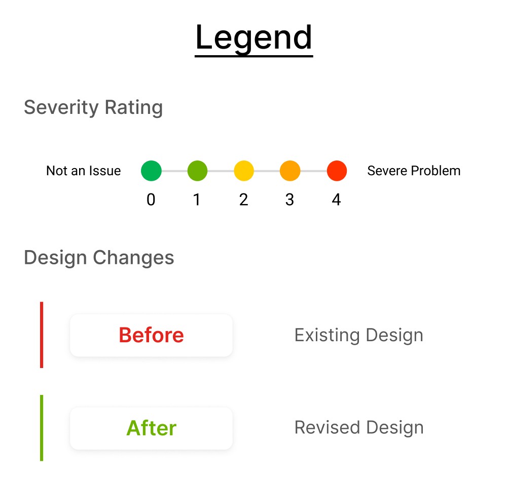
Please refer to this legend to help guide you through our reasonings behind each solution!
Issues
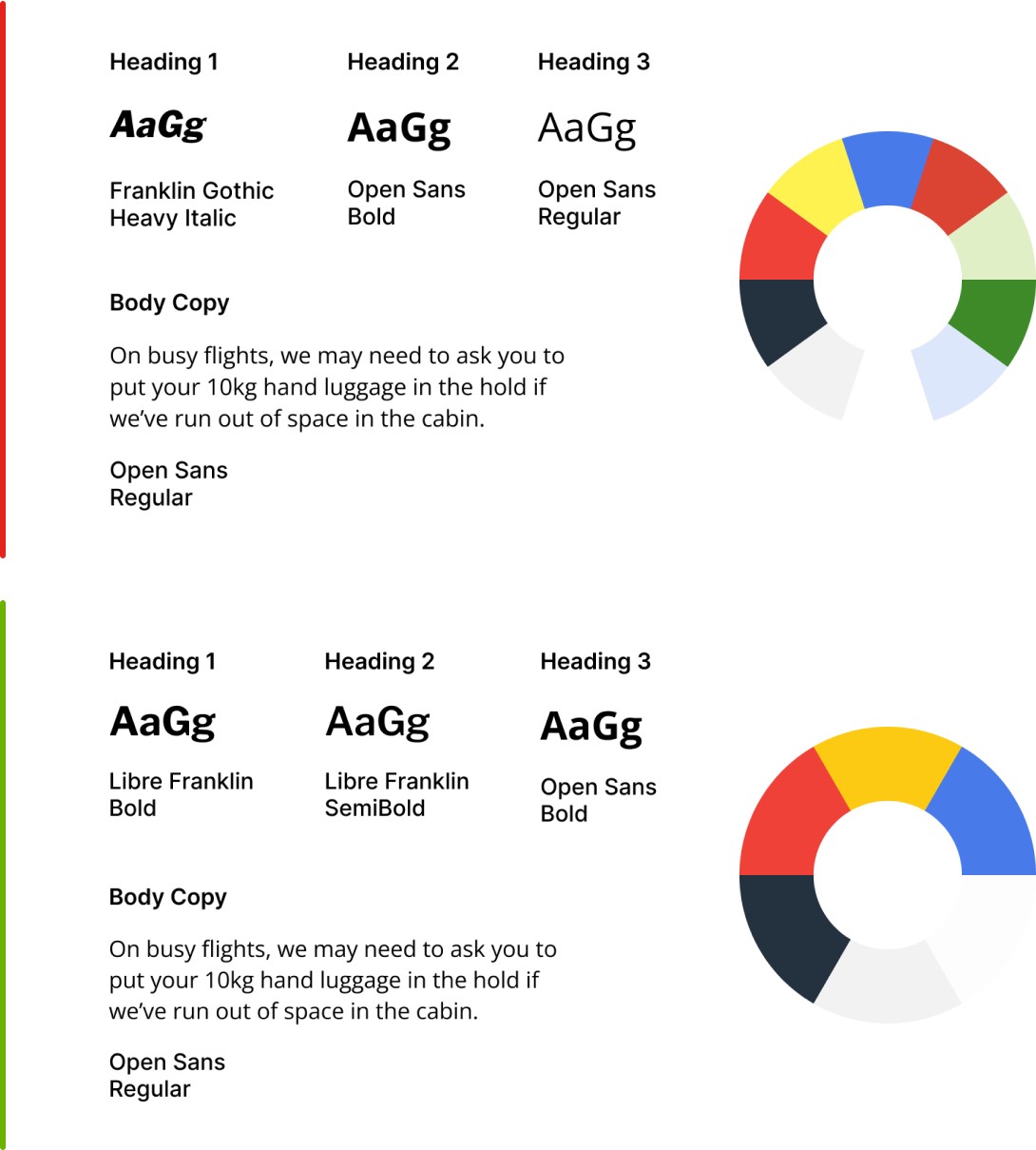
The existing typography and colours needed updating to a more modern look.
There were too many variations, making it difficult for users to scan for relevant information.
Revisions
Address the hierarchy of the website by simplifying typeface use cases and colour palette.
Libre Franklin to coincide with the existing ‘Franklin’ family, whilst offering a more legible font choice.
Open sans was kept for simplicity and familiarity.

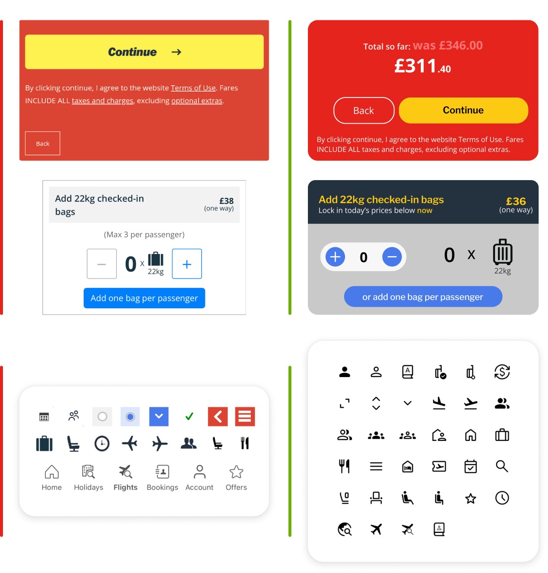
Consistency and Standards
Buttons have been simplified with minimal colours and standard sizes so they are more consistent and cohesive with Jet2’s branding. Icons have also been refined and line weights have been readjusted for balance.
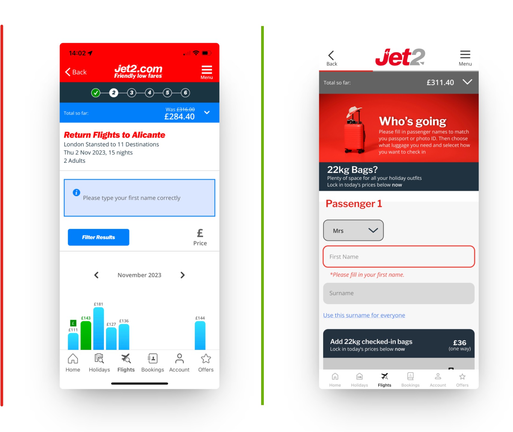
Visibility of System Status
Previously, the progress bar had disappeared halfway during the booking process. This caused confusion and could lead to abandonment. The existing bar also took too much space on the screen so we incorporated a simpler representation to lesser distract the user.


Aesthetic and Minimal Design
Images used were felt very overbearing due to the resemblance to advertisements. The unappealing visuals took too much space without providing much value so we replaced them with more engaging images with relevant context.

Error Prevention
Users were able to proceed to the next steps despite not filling in mandatory information. They were only notified after they continued to the next step. We fixed this by ensuring the CTA button is inactive until all required tasks are completed.
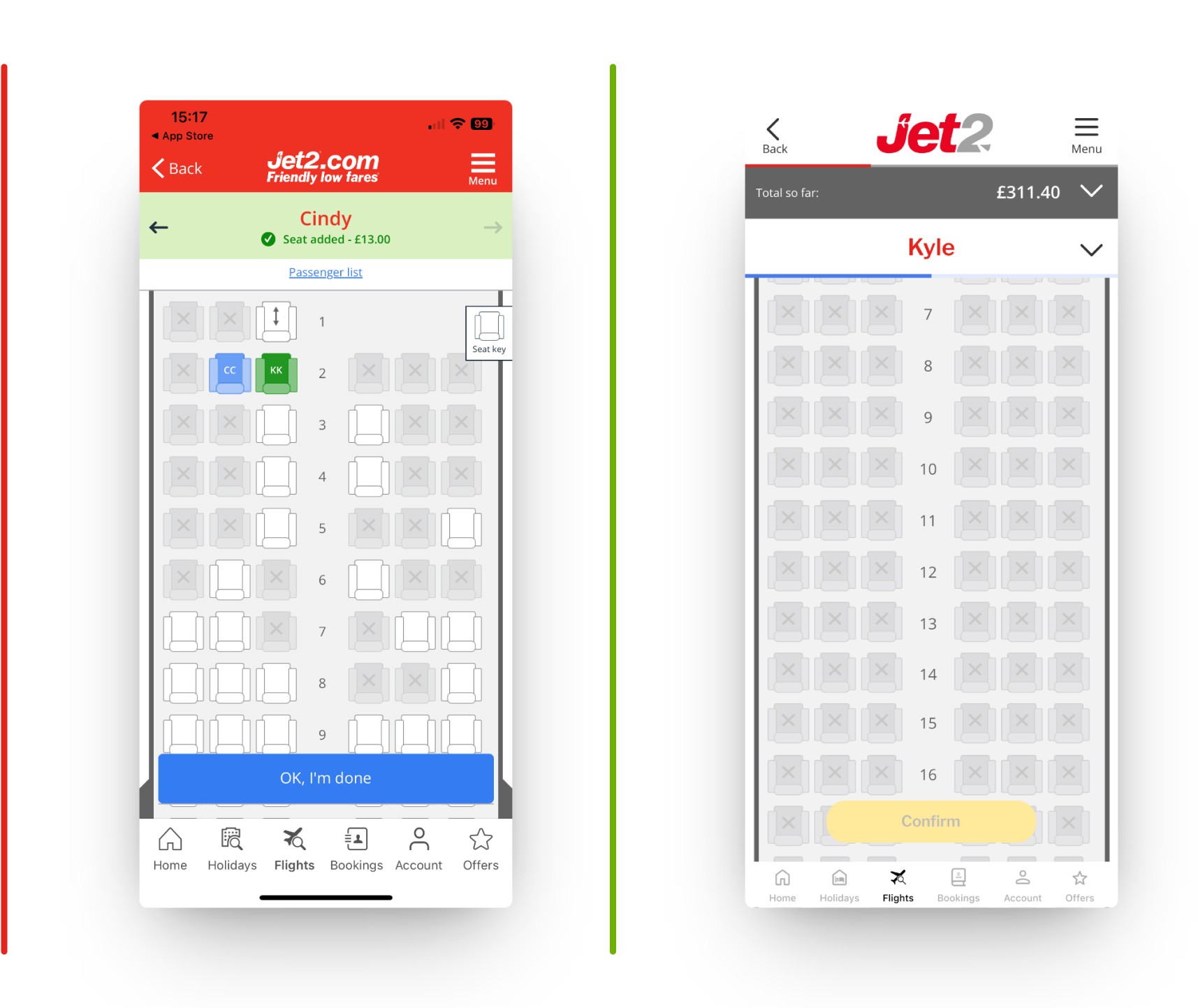
User Control and Freedom
There were various icons confusing the users and an overwhelming number of functions, which makes navigating through the process more difficult. We incorporated cleaner and simpler indicators for users to alleviate this pain point.


Help Users Recognise, Diagnose and Recover from Errors
Error states had various colours and styles, which was difficult to perceive. We redesigned them to better highlight and locate the area of error.
Final Prototype
Closing Thoughts
Key Learnings
Overall, I was pleased with how we conducted the heuristic evaluation to pinpoint key areas for improvement within the task flow.
Heuristic evaluation is a good initial method to see what the surface level issues are, but it can lack contextual uses that are only apparent in real-world use.
We were able to provide qualitative insights, but it is usually not backed by qualitative data so this method is best used for early feedback on the product.
Accessibility is often overlooked, so using heuristic evaluation provided a quick and resourceful method of gaining usability insights before user testing.
Next Steps
Obtain key insights from these changes to identify the effectiveness of our heuristic evaluation.
By understanding the key metrics, we can implement further updates that refine our implementations.
Conduct A/B testing and usability testing to determine what aspects of the task flow needs revision to cater to the customers’ needs
